

In Part I of this article, we discussed the forensics of book structure, paper types and how to spot various restoration and repair techniques when authenticating an ancient book. In this article, we step into the world within the paper itself, identifying the craftsman’s watermarks in the pages of my copy of Lane’s Reports, and attempting to “fingerprint” the sheets within that book to the specific screen mould each sheet was produced from. I believe it possible to extend this analysis to “reverse engineer” the original screen moulds used to make each sheet of paper within my book…
When I visited the Archives Office of Middle Temple in London last year, I was surprised to be handed a small sheaf of analysis papers revealing watermarks within their copies of Lane’s Reports. These papers (pictured below) contained the results of analysis the gracious staff there had done in anticipation of my visit. For me to understand the analysis required a quick education in the art of ancient papermaking, and of the watermarks those tradesmen embedded in the paper they produced (as described in part I of this article).

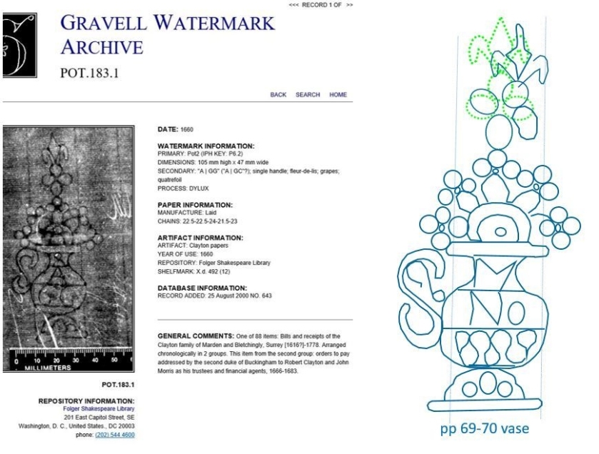
The watermarks they had photographed and identified were the “Pot2” design from the “Gravell Watermark Archives”. Associated with the Folger Museum in Washington DC, the Gravell Archive contains an online database of watermarks from many sources along with their dates of use and documents they were recovered from.
Having a database of images to correlate to is a big advantage, and can be used to validate the origin and age of the paper documents are printed on. In the case of restored books, it can also be used to identify old paper used in a restoration that is inconsistent with the rest of the book.
Papermaking and Watermarks Forensics Background
I found a playful and informative article on watermarks from the Institut D’Histoire Du Livre that included the following statement confirming my thoughts:
If we can work backwards from the object made on the mould to establish the physical characteristics of the mould itself, and thus to relate it to other objects formed on the same mould, the outcome is an important tool for bibliographical research.
Regarding watermark analysis, I found an excellent passage from “Opuscala” in which the historical expert in watermark analysis, Charles-Moïse Briquet (1839-1918) outlines the nature of these forensics, and also provides some great background information:
Every sheet of watermarked paper is in itself its own birth certificate. The difficulty is in deciphering it. Remember that every such sheet bears the imprint of the mould on which it was made. It is therefore a moulded object, like a medal or a coin, of which all the copies are alike. Now, a papermaking mould does not last long, on average not more than a couple of years. When it is worn out, it is replaced by another one, which is never absolutely identical to the previous one; it will differ in the wires, in the number and the distances between the chain lines, by the shape and the size of the watermark or by the placing of the same on the mould. In order to be able to state the date of fabrication of a sheet of paper, it is not enough therefore that it has a watermark similar to that on a dated piece of paper; the watermarks have to be identical, positioned at the same point on the mould, and the sheet-size, the wires and the chain lines must also be the same. It should be remembered moreover that, when making paper, two moulds are used at the same time and therefore, although [these moulds are created] and shaped simultaneously, these two moulds always present some differences.
Analysis of my copy of Lane’s Reports
Sometimes a task just calls out in the middle of the night. That’s how it was with the watermark analysis I had been planning, but hadn’t quite gotten around to. It was a good middle of the night task – carefully going through the book, examining pages under backlight, and photographing all the interesting artifacts buried within the fiber of the pages.
The figure below shows one of the best examples, occurring on page 59-60. The photograph on the left of the page under normal lighting, and the one on the right is the same page, but backlit. What’s remarkable about this example is that two cases just happened to be in near perfect alignment on both sides of the same physical page.

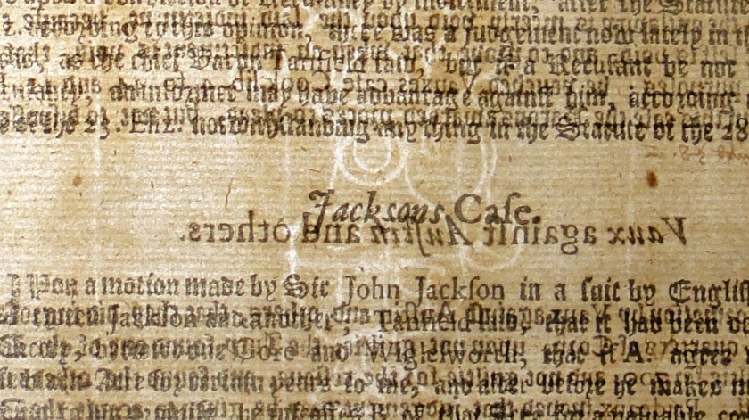
This provided a significant open area which just happened to lie atop a particularly clear watermark. What excellent luck! The next figure shows how I extracted a copy of the watermark from the image. In the zoomed in backlit image (left), you can clearly see the case title, “Jackson’s Case” appearing slightly above the title of the case on the prior page, “Vaux against Austin and others.” Descending vertically through the luck-aligned band of whitespace, you can see the ghostly image of the watermark artwork crossing from the overlaid paragraphs above and continuing into the overlaid paragraphs below.

Carefully tracing out the image, I produced the extracted artwork on the right. I resisted the urge to “correct” the image with what I expected to see, as its important to capture only what really is visible. Later, a comparison of this extracted image with watermarks from the Gravell database will provide more information about this particular artwork. Note that I also captured the “chain” wire locations relative to the watermark symbol. This was done to help me identify whether various watermarks are only similar, or were from paper made from the same original “mould and deckle”.
Repeating the process above for each watermark in the book, and accounting for exact matches, I arrived at the following set of unique watermark artwork contained within my copy of Lane’s Reports. There were a total of 8 watermarks in the book, which aligns with my calculation that the book required 7.5 printed sheets from the Gutenberg-style printing press (using a 4×2 imposition). Two additional watermarks from the Middle Temple book are also shown on the right.

Interestingly, three of the watermarks I found were an exact match for one another. This means that the book was printed from paper created by 5 unique moulds, with one of those moulds having contributed three sheets of the total 7.5 sheets needed to print the book. A second mould produced two of the sheets used, while the remaining three watermarks represent moulds which each produced a single sheet of paper used in the book.
Since I had been provided two watermark images from one of the copies of Lane’s Reports from the Middle Temple archive, I repeated the analysis of those images as well. I was surprised to find that the two images from Middle Temple were a positive match for one another, and that they also matched the emblem found on three sheets from my copy. These two books were clearly printed from the same paper stock!
Other Findings: an apparent mould repair
When I was matching, I not only compared the emblem, but also its relationship to the “chain wire” lines adjacent to it. I generally assumed the emblem would be firmly fixed in place, but discovered this is not always the case!

When I first compared the watermarks from pages 3-4 and 79-80, I assumed they were from different moulds because the chain wire lines didn’t line up. This was an expected outcome, as the paper makers used two moulds in a single production process, which would imprint the paper produced with a mix of those two similar versions of the same symbol. But as I became more experienced with capturing and comparing watermarks, that conclusion nagged at me. The symbol and its relation to the chainwires around it was just too close a match! It finally occurred to me that the problem was my assumption that the emblem would never move once it was affixed to the mould screen. But what if it had? Of course, performing a slight rotation of the watermark symbol itself (without the chain lines) caused it to snap into alignment. It was a match. A very good one.
To double check it, I placed the page 79-80 photograph and its watermark on two different layers, and inserted a tightly cropped image of the page 3-4 watermark in between them. I aligned the chain wire lines on the two photographs and shifted / scaled the inset image until they were perfectly overlaid. Then, I applied a rotation to the (page 79-80) watermark emblem until it lined up with the watermark of the intermediate photograph (as seen in the photograph above). The perfect match was confirmed!
Page 3-4 and page 79-80 had indeed come from the very same mould, but the top of the symbol emblem on that mould had rotated 2º between the making of one sheet and subsequent making of the other.
This is the only instance of watermark rotation I have observed, so I don’t think this should imply that the emblems were not generally firmly attached to the screen mould. My theory: in this case, I’ve managed to observe paper created before and after a repair. After the first sheet had been produced, the upper portion of the emblem came loose and was re-attached (in a slightly different location) before papermaking production continued. The second sheet was produced with the emblem in its slightly different location.
I’m a bit proud of myself for not falling for that old “shift the emblem on the mould to mess with the historians” gag!
Other Findings: a badly damaged emblem
Two of the watermarks I extracted were an enigma. One was so faint / incomplete I could only identify it to the level of being of the “pot2” category of “one handled” pot watermarks in the Gravell database. The other watermark was mostly intact, but the upper portion was a very strange, lop-sided jumble that resembled a flower with an odd antennae above it. At first, I assumed the true emblem was just too faint to be discerned, but I couldn’t find anything that even vaguely resembled the images I was seeing in the Gravell database.

Then I had an idea. I looked at all the general types of “Pot2” emblems in the database to see if any of them seemed to have even a vague structural resemblance to what I was seeing in my watermark. I just wanted to see if any of them would cause my problem watermark to “speak” to me. And one did! Of course, it spoke in an “up all night drinking before being mugged in the park” kind of voice…
It was the rotation of the oval petals of the large flower that helped me find my way to the breakthrough. They looked as though they had been bent over and smashed to the right. When I looked at the “fleur-de-lis” of POT.183.1 from the Gravell database, I wondered: could the jumble above the bent flower possibly be the wreckage of a fleur-de-lis? I really didn’t think so, but gave it a go anyway. I traced out an “ideal” fleur-de-lis top for my watermark (based on the Gravell-provided example). I then I looked at the pieces of the real watermark, and began rotating and shifting them about. Sure enough. I found myself assembling a badly mauled fleur-de-lis!
So, the watermark on page 69-70 appears to have been left by a badly damaged “single-handled” Pot2 style watermark that had been originally created with a fleur-de-lis headpiece. The initials “M” and “No” on my watermark are unique, and so is the wavy ribbon pattern on the bottom of the pot. There is an odd shape in the upper part of the handle that doesn’t make sense, though. Perhaps in other copies of Lane’s Reports I will find another example of this watermark and can better understand what that odd shape is…
I’m have to say, I’m pretty happy about being able to solve the mystery of this watermark. I will have to see if I can find other examples of this very unique artwork in other copies of Lane’s Reports.
Someday when my research is completed, I will plan to “pay it forward” to the folks at the Gravell Archive by submitting records for the new watermarks I’ve uncovered.
Reconstructing the screen moulds used to print Lane’s Reports
Being an ambitious sort, I realized that if there was only one emblem on each sheet of paper (which seems to be the case), and the pages of the book were laid out in order (an assumption), it should be possible to “reverse engineer” the typeset of the book as it was originally laid out, and by aligning the chain lines, to essentially reconstruct an image of the original screen mould. Of primary interest, that reconstruction would show the watermark as it was originally placed on the screen mould. My inner geek is pretty excited to see if I can actually pull that one off!
That the pages in Lane’s Reports would have been printed “in order” seems a reasonable assumption, as the publisher would be working from a manuscript. The typesetter would need to lay out the text of one page line-by-line to know where the page breaks would lie. So, it makes sense that each side of a 4×2 layout would be created, printed and checked before going ahead with a print run, with each sheet of the book being accomplished one after another. In a perfect world, it might have worked out that way.
[Spoiler alert!] It appears that we in the modern world did not invent “fubar” – we just gave it an acronym.
First, I needed to determine where the “gathers” are within the pages of my book. In a perfect 4×2 layout, I expected to find groups of 16 pages of text appearing on 8 adjacent physical pages, which are all part of same sheet of folded paper. I would then expect to find one watermark for each group of 8 physical pages. It wouldn’t always be in the same place within each group (since the same sheet of paper could be laid down four unique ways–spun or flipped, and front or back), and different watermark emblems were not guaranteed to be mounted in the same location on the mould. But there should be one watermark every 8 physical sheets of paper. How perfectly pollyanna-esque of me to expect it to have turned out that way…
My first brush with reality came when I went looking for one watermark to appear somewhere in subsequent groups of 16 printed pages. After all, I had found a total of 8 watermarks (precisely the number of watermarks I would have expected for the book). but they didn’t occur one per each 16 page grouping – not even close. I found watermarks on the following pages:
- Front Table page
- page 5-6
- page 59-60 (this one appears after a watermark-less gap of more than 50 pages!)
- page 69-70
- page 75-76
- page 79-80
- page 109-110
- page 111-112
Puzzled, I decided to see if I could understand the gathers to see what was wrong with my model of how the book should have been put together. In this endeavor I had more luck, but it was painstaking work. First, I closely examined the binding, where I was able to see the gathers were not evenly spaced as I had expected.

I photographed this more closely, and analyzed it as carefully as I could. To do this perfectly would require deconstructing the book – which I am not prepared to do!

Between carefully analyzing close up photographs and physical examinations of the gathers I could see, I came up with the following table.
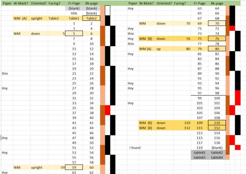
I had hoped that some order would pop out of this analysis and it would all make sense. I had to laugh when I realized the irony that the answer lay in why it didn’t make sense. The vertical tan bars illustrate the sheet boundaries of a 4×8 layout (the light color indicating the upper half of a conceptual sheet and the darker color the 4 physical pages of the lower half of that sheet). Next to that are two columns in which the alternating black bars represent the apparent page groups I determined from analyzing the binding.
This general 4- page grouping (vs groups of 8) implies that either the book was printed on half-sized sheets, or that they were cut in half before folding. The randomness of the watermarks makes me think its more likely the sheets were cut in half and printed in a 4 page imposition, most likely in a 2×2 layout to provide even pressure from the press. I suspect taking one of these books apart would be required to establish this with certainty. But it seems clear enough that the book is based on 4 leaf gathers, even though the number of watermarks is consistent with full sized original sheets. Printing a smaller set of pages at a time (4) might have provided a more sustainable rhythm to the printing process, and would have required a much smaller pool of typeset elements. It would be interesting to see if this was a pattern for other period publications as well.
It appears there were problems in the printing of this book. Looking again at the analysis table, you can see the appearance of red bars, representing anomalies to the “groups of 4 pages” theme that seemed predominant (if anything did) in the binding of this book.
Also, there does appear to be a single 8-page grouping in the middle of the book. Was it possible that the book was printed in a full 4×2 imposition, but only one of the eight printed sheets was usable as it was first printed? Not likely. Note that no watermarks occur within that large, 8 leaf gather. This suggests that either some of the original paper sheets did not have watermarks, or that this large gather was put together from parts of more than one sheet of paper. Although paper without watermarks was certainly produced, this would likely have been the case for a lesser grade of paper and from a different manufacturer. To avoid mismatches in paper appearance, it is more likely that paper for one book job would have been from the same stock. So in the end, I would expect to find that either I mistook two gathers for a single, larger gather, or that larger gather is composed of more than a single sheet of paper.
Overall, the analysis suggests this first book of published cases in the Exchequer Courts had inadvertently captured evidence of another important legal precedent – that of “Muphy’s Law”. Despite the certainty that a single print and proof-reading would have been conducted as each sheet was typeset (and before a printing run was commenced), shifts in the “goups of 4” suggest that errors were found and recovery plans formulated while the printing was in already progress. This pattern would result if errors were found in a printed sheet affecting some printed pages, while other portions of that sheet could be salvaged.
At the four anomalies groups of one, two and three physical pages seem to have been added to other gathers, or were made into small gathers of their own. Subsequent sets of 4-leaf gathers indicate an attempt to resume the normal typesetting and printing from there. I suppose we’ve all had days where things didn’t go as smoothly as planned. Which makes me wonder: what alternate modes of swearing were available to printers at work in the heart of puritanical England?
Unfortunately, it turned out this printing outcome was not regular enough to allow me to reconstruct a screen mould as I’d hoped. I’m disappointed, but perhaps I will find another book I can try this with someday!
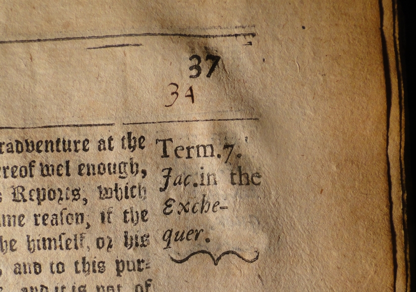
To the ultimate credit of the printer, despite the apparent anomalies encountered during the printing process, so far I have found only a single error in the book. On page 73, the page number has been transposed, reading “37”. I’ve checked, and this same error can be observed in every printed copy of Lane’s Reports I’ve encountered so far. I did find evidence of a correction that had been made. Did you notice it also? Most likely after an initial test printing and review. If you review the first line of text in “Jackson’s Case” (pp 60), you’ll notice that the font of the words “John Jackson” in the middle of the line do not match the fancy scripted font used in the rest of the book. It appears that an error was found in the name, and those letters were replaced. Apparently, the person who made the change grabbed the letters from a different typeface kit. And there you have it – proof that they did have more modern typefaces available, they just chose not to use it for this book! I have to agree with the choice, it may be harder to read, but the “Older English” stylized font has style!
In the end, the durability of this book is a testament to the skill and materials used to publish it. This is a working book, which has obviously undergone a great deal of handling, and is filled with quill-pen notes. That it is still in such serviceable condition after these several centuries is a testament to the soundness of its construction, despite the apparent difficulties encountered in the process of producing it!
——
Your comments and corrections are gladly welcomed. I admire great writing, but have little choice but to approach this task as one of grinding a workable edge onto a rough blade – with my thanks for your generosity of spirit and firm critique in the meantime!
–-Greg Sherwood

Hi Greg, you’re a regular archaeologist! I wonder if the paper-maker was of French origin, with the fleur-de-Lys (lis) element of the watermark. The clovers or crosses atop the jug or vase, and the crescent, chalice, crown (?) are interesting as well.
LikeLike
Actually, watermarks that seem to be in the Pot1 family were catalogued to be of French origin, so it seems a fair guess that all of this paper was French. I didn’t include that in the article because I still want to do some validation of it. So glad you are enjoying the articles! These last two were fairly technical…
LikeLike
I enjoy the teacher in you. I had no idea that I would get an education on paper making, watermarks, chain lines and possibly how books were made in the yarn of yesteryear.
I am thoroughly enjoying all that you are writing. Though this may not be the best seller of fiction or nonfiction, you are providing enough exquisite detail that One can almost see the printing press, the building of paper, the binding… Not to mention the essence of what happened to the keeper of the seal.
When you do your rewrite can finally put this into a book, you will then have to decide if you are writing a history book or are you writing nonfiction, I don’t know what to call it, Book. Other than well, a history book
Very impressive is all I can really say. Keep up the good work.
Dave
LikeLike
Wow. Thank you. I’m thrilled you’re enjoying it!
LikeLike
A] Good reminder that there are indeed ideal projects to be undertaken while up all night!
B] Nice that your watermarks ended up in the middles of pages; had wondered how securely the patterns were wired on. Have read a few articles where only partial conclusions could be drawn, because many of the marks were down in the gutter, in a tight binding no less!
LikeLike
Greg, Cyndi and I used to live just a couple blocks from the Folger Museum in DC! Many a time I/we would walk by it (the Folger Shakespeare Theatre housed there as well) going to a local bodega or neighborhood diner. This was back in the early 1990s. Little did we know that venue housed an aspect of your Richard Lane treasure hunt through history more than a decade later. Very cool!
LikeLike
There appear to be THREE fonts used in the Jackson Case! “Jackson” is one font; “Case” is the same as the “John Jackson” below, and then there is the Olde English font for the rest of the book.
I must say it seems a part of some Divine plan to have put this book into your hands (not unlike to time you took an industrial tire to your vehicle on I-25 and saved everyone’s life, including your own). Your engineering background, artistic talents, and insatiable curiosity have combined to make you the perfect person for this project, which has so many tentacles into so many other areas of specialty.
Having done the tedious work of making folded books/booklets for children and in marketing, the pages cannot be laid out “in order.” Not only are they out of order, half of them are upside-down. Printing a two-sided, multi-sheet book(let) is not for the faint of heart!
Some software programs I’ve used in the past will automatically print each page as it should be to be folded into quarter sections and bound. All of it is beyond me as an instinct. It takes me mind-numbing predictions and trial and error to finally come up with the proper configuration if I have to do it manually (not so for an engineer, I suppose). Consequently I’ve done very few folded books manually. I’m on good terms with modern swearing usage and techniques! My skills in the historic genre needs work.
Love the use of humor and playfulness in your writing! Reads very well, and leads us on a merry chase through new areas of erudition. Bravo!
LikeLiked by 1 person